

Data Visualization Tips can be helpful when you have abundant data in textual format. Having a defined audience who should consume your data is your cue to create sleek and compelling data visualizations for them.
"Most people will believe whatever you tell them as long as a chart is involved"
– Blinded with science study
Data visualization is a work of art, as much as it is of science, to depict and recreate the same data differently and graphically. And to enhance the experience, data visualization tools and tips have proven to be of great help.
From data storytelling to deciding the proper format of presenting the data, it's a process full of micro-decision-making to make the outcome coherent and elegant.
Here are just a few yet essential data visualization tips that you should keep in mind:
Data storytelling: A subtle art of not giving too much data

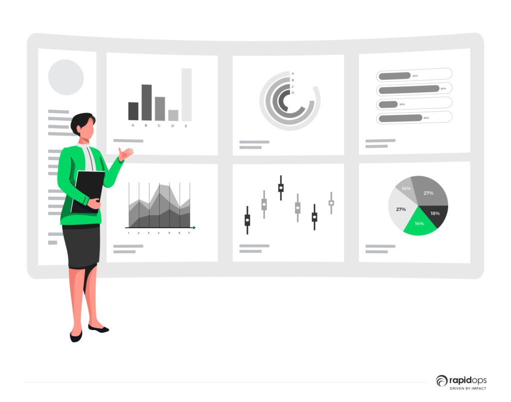
Data visualization is a powerful way to convey complex information in a visually appealing way.
We have seen all kinds of mark sheets, spreadsheets, and balance sheets. When did we love diving deep into that data and working for hours?
Now, think of the time you saw a dashboard representing the same data in the form of graphs, charts, maps, etc.
Didn't it make the whole boring thing interesting?
Every piece of data, every class, and every group of data tells a story, whether about your financial year or how your business has performed in the past year.
That lengthy form of content is complicated for brains to process and progress on.
Data must be represented in a legible and comprehendible format to avoid challenges while deriving possible outcomes and predicting the future based on it. Considering this, incorporating an agenda slide PowerPoint template can further enhance the presentation of data, facilitating better understanding and engagement.
Finalizing formatting: Just as easy and challenging at the same time
"Charts are not just mere illustrations; they are not just drawings, they carry meaning."
– Alberto Cairo, Visual and data journalist
Charts, graphs, infographics, PowerPoint slides, and many others are formats to show your data in an interactive and intuitive way.
Depending on your data, you should select the format that makes sense to the users.
- When you need to show a comparison, a bar graph is a better choice of format.
- A 'bullet chart' is the right choice when the data depicts goal comparison.
- To show the comparison among categories, a 'box plot' and 'histogram' make more sense to consume the data.
- For geographical representation, the right choice would be 'maps' obviously.
Selecting the right amount of data for storytelling through a suitable representation model is quite essential.
Colour and text: Deal-maker or deal-breaker
Here are the two sets of graphically represented data; both contain tons of data and insightful information.
Which one looks appealing to your eyes and interesting to your brain?
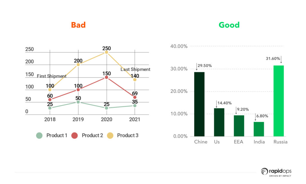
I'd go with the second one, and hopefully, you too!
Your choice of text and color on any graphical representation of data can make or break the deal.
You should avoid writing descriptive content on visualization because more text distracts users.
Depending on the title, the colors of the visualization should be defined. While creating data visualization, we must remember that there is color psychology that works at the back of the minds of all users.
So, using colors or text that are too bold and loud for a title such as 'public health centers across North Carolina' wouldn't satisfy the motive behind creating a data visualization.
Less is more: Keep it simple
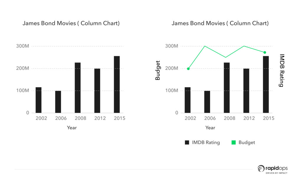
Example: Take a look at the world box office earnings for the last three James Bond movies using three different formats. Which one is easiest to read?
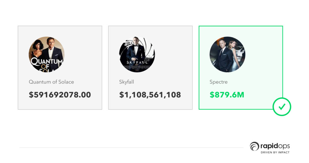
This Example shows how keeping things simple is more sensible than putting the data in a complicated and fancy way.
Adding more colors, labels, or texts to the charts will only increase the complexity for the end-users who can be your target audience.
Cluttered data, adding 3D elements, more information in the form of text, etc. will just make users lose their interest which is not our goal.
Putting the data in unbalanced or complex structures and designs might fit more information but will obviously miss out on gauging eyeballs and hence the interest from your target audience.
Remember, the motive behind creating data visualization is to give more clarity on the data, not how beautiful the representation looks to the audience.
Showing the right relationship among data is as imp as being in the right one!
Sometimes, one dataset shares a relationship of one-to-many with other data sets, and that’s when creating visualization becomes crucial.
The difference in units of measurements, timelines, and much more affects the visualization as a whole.
It is when choosing the proper format that helps in making the visualization better. Heat maps, scatter plots, and bullet charts are the right choices for showing data correlations.
Closing lines
Changing long texts into graphics doesn't solve the problem. Placing the right amount of data in the right section to convey the message and impact users' perspectives is the goal. If you do so, you'll surely steal the show.
Data visualization tools and techniques can be numerous but keeping the basics in mind also helps create relatively less cluttered and sleek visualizations.
There is no harm in saying, 'If you can visualize your data correctly, you can visualize your future accurately' because that's the whole point of creating visuals in the first place.

What’s Inside

Let’s build the next big thing!
Share your ideas and vision with us to explore your digital opportunities
Similar Stories
- Analytics
- undefined Mins
- July 2019


Receive articles like this in your mailbox
Sign up to get weekly insights & inspiration in your inbox.