

Data visualization tools is a term that we did not know about a decade ago. But data was always there, way before we knew how intelligently we could utilize them to predict the future.
Do you remember entering your personal details on websites, megastores, and social platforms? How often must we have entered our email address or contact number online?
We receive more than a hundred emails per day from various businesses! That's just one kind of user data that we are talking about. Our digital footprint is vividly visible on companies' databases based on which we receive information that we are interested in.
We are close to 8 billion people on this planet, and it's impossible to imagine the data we all must have shared online.
So how is it even remotely possible to segregate the data based on consumers' interests, age, professions, and many such filters?
That's when data visualization tools come in!
What are Data Visualization Tools?
Well, let's address the elephant in the room. If I may know, which one of these two you'd pick to understand the data?
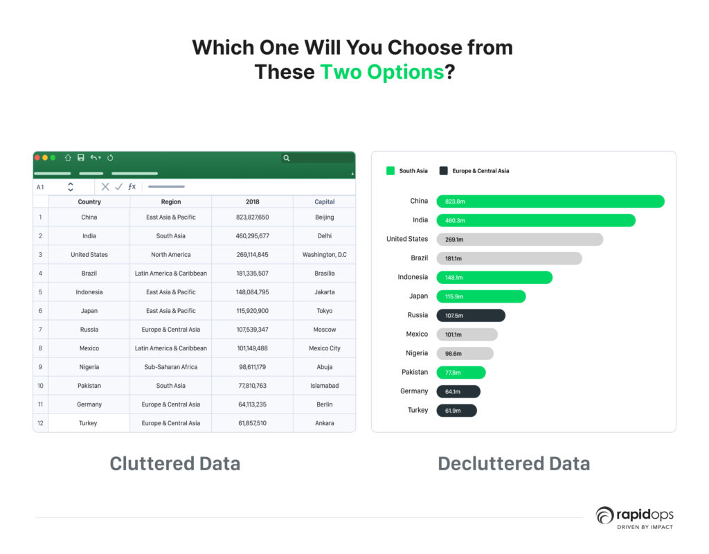
If you have said the latter, I am with you, and if you chose the first image, well, you have my respect!
Data visualization tools help you see and study your data better.
You'll be able to define and derive conclusions from the existing data that's always been there stored in some database but now looks straightforward.
Eventually, it will also lead you to find patterns in user behavior which will help you predict the future!
Here are our top picks curated just for you to decide on a data visualization tool for your org.
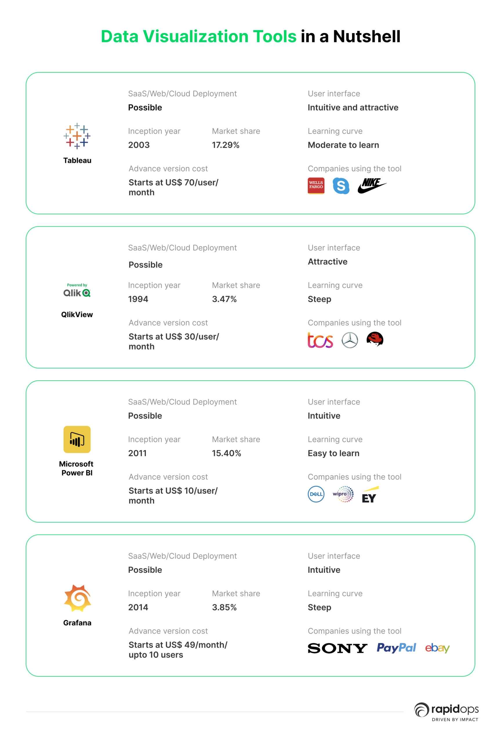
1. Tableau
Tableau is well-known data visualization tool among data science professionals for two fundamental reasons
- pretty easy to use
- a potent tool
It provides various options to visualize your data, from pie charts and graphs to histograms.
A plethora of companies use this tool for their businesses. Their clientele includes
- Nike
- Wells Fargo
- The New York Times
- Skype
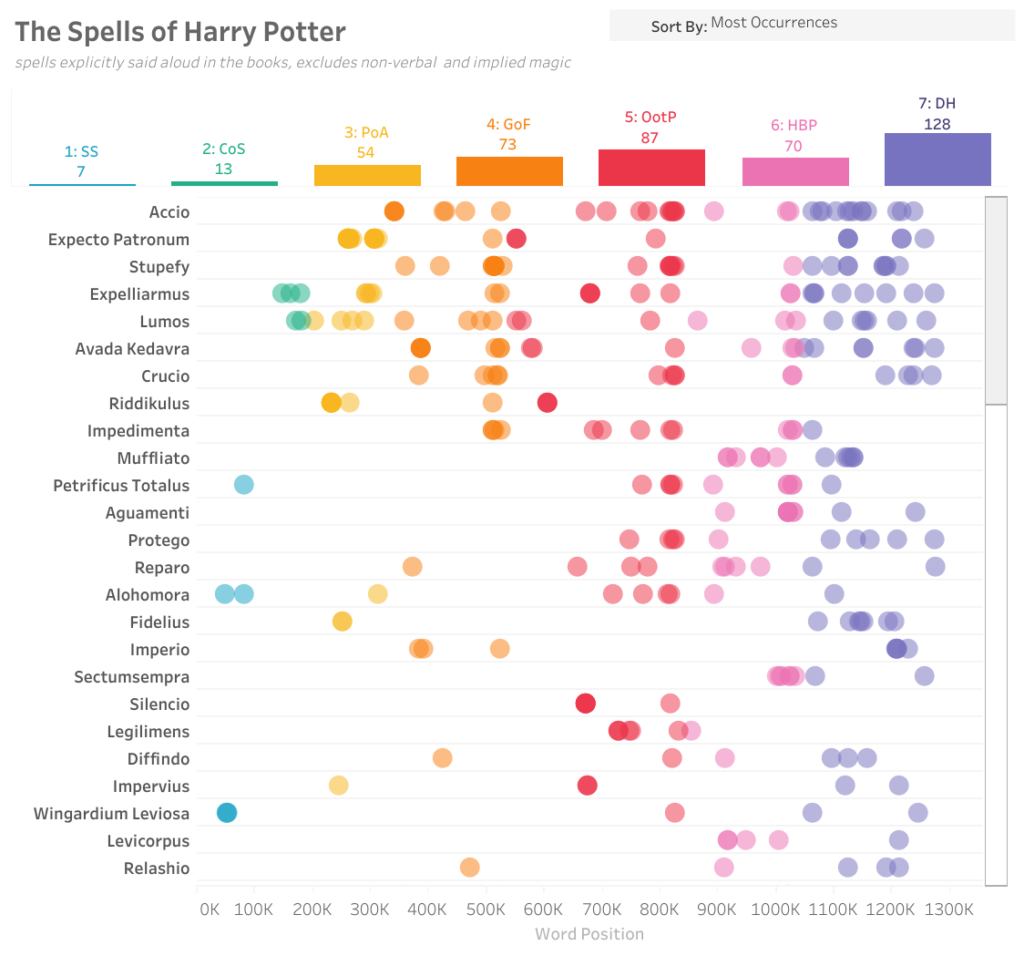
Here's an example of data analysis performed on Tableau:
Features of Tableau
Let's look at some of the most interesting features.
1. User-friendly
It provides an extremely user-friendly and powerful interface to its users.
2. Highly collaborative
The platform is highly collaborative when it comes to working with a team on a report or data analysis.
3. Integration
Integration with various databases is easy; fetching data from multiple sources is not an issue.
4. Multiple data sources
Equipped to handle multiple kinds of data coming from different sources.
5. Huge community support
It is used by many people and organizations worldwide, so community support is huge.
It comes with two options; one is public and accessible, and another is subscription-based. If you opt for a free version, your data analysis can be viewed by anyone on the Internet.
The creator software subscription starts at US$ 70/user/month that keeps your data and data analysis private.
When the data is enormous and too complex to understand, it is advisable to use Tableau.
It comes with a vast literature of video libraries to better understand the platform's usability. This allows users to utilize all kinds of features to perfect their analysis.
2. QlikView
Unlike most data visualization tools, QlikView is a data discovery platform and a data visualization tool that enables users to make accurate, informed, and faster decision.
QlikView provides a sleek and easy-to-use interface that allows users to import and integrate data from anywhere, be it a spreadsheet or a database, without writing a single line of code!
Starting from enterprises to small companies, QlikView is a go-to data visualization tool for
- TCS
- Cognizant
- Red Hat
- Mercedes Benz
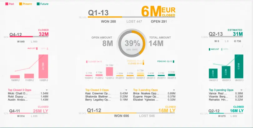
Here's an example of data analysis performed on QlikView:
Features of QlikView
Below are some of its most interesting features.
1. Data associations
When a user enters and integrates data on the platform, QlikView recognizes Data associations automatically.
2. Advanced dashboards
It provides highly interactive and advanced dashboards for a better user experience.
3. Fast rendering
Considerably the fastest loading speed even when millions of instances are associated.
4. Easy to share
QlikView dashboards make it easy to share and collaborate on reports for more than one team member.
The basic pricing model starts at US$ 30/user/month. Enterprise pricing is considered the most expensive among the top data visualization tools.
QlikView is a perfect choice for any business that deals with multiple verticals on different scales.
QlikView is undoubtedly the best choice if you want to have all the features in one place, i.e., data discovery, data visualization, and collaboration on your findings.
3. Microsoft Power BI
There are more than 200K+ organizations that rely on Microsoft Power BI for their business intelligence needs
Microsoft
If you are keen on doing predictive analysis, self-service analysis, or anything around business intelligence, Microsoft Power BI is the right data visualization tool.
It is developed and supported by Microsoft. Power BI comes with a simple and sleek web-based interface but has full potential to compete with the other data visualization tools in terms of features!
Microsoft Power BI also provides android mobile app support that QlikView doesn't.
Microsoft Power BI is used by
- EY
- Wipro
- Deloitte
- Dell
- Capgemini
Many more enterprises ranging from medium to even large ones use Microsoft Power BI.
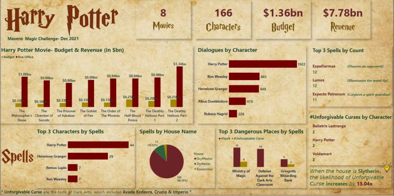
Here's an example of data analysis performed on Microsoft Power BI:
Features of Microsoft Power BI
Let's get some insight into its features.
1. Basic version
Microsoft Power BI provides the basic version for free to let the users explore and play with the features.
2. Interactive dashboards
It enables users to check real-time data through interactive dashboards, which leads users to create accurate data analysis.
3. API Integration
Simple API Integration is enough to incorporate Power BI into all kinds of apps.
4. Multi-platform support
Microsoft Power BI provides support on all platforms, like, desktop, web, and Mobile.
5. Integrations
It provides integrations with Google Analytics, MailChimp, Office 365, and other essential apps for the ease of users.
Microsoft Power BI offers a basic version free, and the paid plan with multiple integrations and features starts at US$ 9.99/user/month.
When you have to integrate data from different verticals and create a collection of visuals, it is a great tool to run reports and surface insights based on the given data.
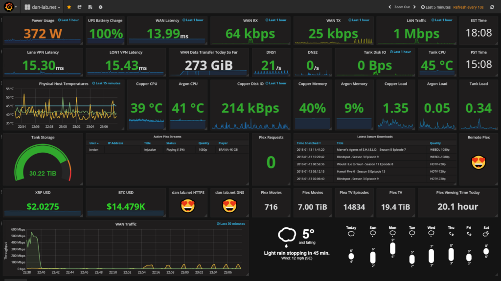
4. Grafana
Grafana is an intelligent data visualization tool that interactively portrays data and tells you what your users' behavior is. They call it 'Revealed Behaviour.'
It lets you extract and reuse the data by integrating all data sources into one organized view.
Grafana's client list features
- Bloomberg
- eBay
- PayPal
- Sony
- JP Morgan Chase
Here's an example of data analysis performed on Grafana:
Features of Grafana
Here are some of its most revered features.
1. An open-source platform
Grafana is an open-source platform that makes software freely available for all users.
2. Deployment
It is easily deployable on Cloud or any other web platform.
3. Database support
It natively supports many databases on its platform to fetch data from.
4. Digital footprints
This tool accurately predicts and tracks users' digital footprints to make informed analytical decisions.
5. Data reusability
It understands the connection among databases, and hence, once data is uploaded on the platform, it allows users to reuse them as and when needed.
It provides a free basic version to explore the platform, and the pro versions sell at US$ 49/month for up to 10 team members.
If you need to monitor the infrastructure within the org and log and track user behavior to enhance operational efficiency, Grafana can be proved extremely helpful.
5. ChartExpo
ChartExpo is an easy-to-use visualization plug-in for Google Sheets, Microsoft Excel, and Power BI.
Here are the easy steps to visualize your data on ChartExpo:
• Select a chart. Select your data.
• Click the "Create Chart" button.
That’s it.
Share and publish charts by following these steps:
• Download the dataviz as PNG, SVG, PDF and JPG
• Embed chart templates and reporting templates in blogs or websites
• Post on social media
• Create presentations, dashboards & Reports from charts and graphs
Features of ChartExpo
Here are the distinctive features of ChartExpo:
Reduce time to insight
Focus on what matters and stop wasting time with unintuitive chart creation tools. ChartExpo makes discovering insights easier and more timely than ever.
Protect your data
With data breaches frequently making headlines, no one should feel comfortable sharing or uploading their data to third-party tools. ChartExpo’s plug-in framework means your data stays exactly where it is, securely in your hands.
Keep working with your favorite tools
You don’t need to learn yet another software. That’s why we designed ChartExpo as a plug-in for Google Sheets and Microsoft Excel. You can keep using your favorite spreadsheet tools without interruption.
Final thoughts
Businesses deal with an overwhelming amount of data daily. While many options are available, going for the most potent and equipped tool won't solve the problem every time.
You should select the best suitable data visualization tool for you and your business.
Selecting and working on the right tool will help data science professionals gain a better perspective on the deliverables and help them get accurate results.
We at Rapidops use multi-dimensional data to predict and prepare for the future, and we also help our clients in doing so.
Let's sit on the pile of papers and spreadsheets to watch the wonders that data visualization dashboards unravel!


Let’s build the next big thing!
Share your ideas and vision with us to explore your digital opportunities
Similar Stories
- Engineering
- undefined Mins
- September 2022

- Engineering
- undefined Mins
- January 2016

- Engineering
- 5 Mins
- November 2015

Receive articles like this in your mailbox
Sign up to get weekly insights & inspiration in your inbox.